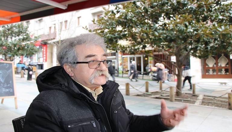
Emile Menhem, photograph from Al Modon.
Emile Menhem: Invigorating Arab Journalism Through Graphic Design
By Lara Balaa
Khatt Books, 2019
Graphic design played a significant role in the evolution of Arab newsprint. Arab graphic design historians locate this art’s roots deep in the region’s visual heritage, drawing from its history of calligraphy, geometric compositions, motifs, and colors. However, the field itself is relatively new, emerging as a discipline only in the late 19th and early 20th centuries. Graphic design now plays a widespread role in everyday life, whether in public architecture or the design of everyday items.
The first generation of Arab graphic designers during the 1940s and 50s included Abd al-Salam al-Sharif and Hussein Bikar, succeeded by Abdul Ghani Abu al-Enein and Hassan Fouad in the 60s. A third generation emerged, including Diaa al-Azzawi, Burhan Karkotli, and Helmy al-Tuni throughout the 70s. The fourth generation, active during the 80s, included Youssef Abdelki, Munir al-Shaarani, and the Lebanese artist and editor, Emile Menhem. Menhem’s work would revolutionize the vision of newspapers and journalism. His contributions set many of the specifications, rules, and professional standards in journalistic design work. One recent book, “Emile Menhem: Invigorating Arab Journalism Through Graphic Design” by editorial designer Lara Balaa (Khatt Books, 2019), offers a rare glimpse into the life and works of the graphic designer and creative director. The book reflects his “identity, experience, and development over the decades.”
Born in 1951 in Ijdabra in North Lebanon, where his father was mayor, Menhem grew up in a family with three boys and one girl. He attended middle and high school at the College Saint Joseph des Peres Capucins in Batroun, where his uncle inspired his progressivism. He frequently visited his uncle, the priest Tanios Menhem, who was known for his progressive political orientation. Tanios — also known as the “Red Priest” for his support of the Latin American Liberation Theology — was a friend of the Communist Party and supporter of Egyptian President Gamal Abdel Nasser. A journalist, educator, linguist, and writer, he hosted many artistic and literary discussions in his home, conversations that fostered the young Menhem’s interest in arts and literature.
In 1970, Menhem enrolled at the Lebanese University in Beirut and graduated with a double major in fine arts and Arabic literature in 1977. In 1978, he shared a studio with fellow artists Samir Khaddaj, Seta Manoukian, and Hussein Yaghi in Burj Abu Haidar, producing paintings and other projects. He loved cinema, working on a few film posters for European films, including “Les Sans-Espoirs” (Hungary, 1966) directed by Miklos Jansco and “La Terre de la Grande Promesse” (Poland, 1975) directed by Andrzej Wajda. Menhem designed novel covers and illustrated books. He also worked with many musicians, designing album covers for Khaled al-Haber, Sami Hawat, Ziad Rahbani, and Omaima al-Khalil. Menhem is perhaps most prominently known for his designs for Lebanese music composer Marcel Khalife. As an artist, he took part in many exhibitions in Beirut and later in Paris, though he currently does not paint anymore, according to Bashir al-Bakr in Al Modon.
Menhem joined the Lebanese Communist Party in 1968, producing posters for the party throughout the 70s. Here, he discovered his attraction to the process of design. Though he left the Communist Party in the early 1980s because he considered it “too dogmatic,” he remained a friend of the party and occasionally produced posters for them, as cited by Balaa.
A humanist who sympathized with marginalized groups, Menhem began producing the pro-PLO magazine Falastin al-Thawra in 1976, the year the Lebanese University stopped operating because of the outbreak of the civil war. The magazine, led by journalist and writer Majed Abu Sharar, was published by the Unified Palestinian Press. Menhem worked alongside Iraqi poet and artist Muayyad al-Rawi and Palestinian artist Adnan al-Sharif, among others. During this time, his posters depicted battles, commemorated milestones in the history of the Palestinian struggle, ideological stances, and support for the Palestine National Liberation Movement.
His work with Falastin al-Thawra ended in 1982. The outbreak of the Lebanon War uprooted much of his life. When Israeli forces invaded Lebanon in June 1982, Menhem was in Cyprus visiting his friend, the artist and writer Nabil Abou Hamad, and found himself unable to return to Beirut when the Lebanese airports shut down. They robbed his home in Beirut, and he lost much of his design work. He chose to emigrate to France where his brother had already been residing.
In 1993, he met his past lover, architect Lamia al-Khatib, and they married and moved to Montreal, Canada, where Khatib had an employment contract to complete. During this time, Menhem honed his computer skills until their return to Lebanon in 1996. Although Menhem had worked with editorial design early in his career, it did not fully take off until his return to Lebanon.
Menhem applied his artistic experience to journalism. His deep understanding of journalism as an “integrated field of communication” gave him the adaptability to reinvent and excel at his work. Menhem developed letterforms and recognized the need for solid typefaces. In the words of Bakr, “His style of journalistic design matured and became the pioneer of an unparalleled school in the Arab world.” As cited by Lara Abboud in Al Araby, he applied his knowledge about various printing and production techniques, including manual typesetting, phototypesetting, and contemporary digital design.
Menhem is credited with introducing Kufic — a style of early Arabic script — as the typographic style used in Arabic journalism. Early in his career, he experimented with lettering, seeking Kufic-inspired bold forms that could “speak with authority” and “act as dense compositional blocks.” Kufic letterforms organized space and removed awkward negative spaces, balancing the composition with its solid visual mass. According to Balaa, Menhem argues that “historically, we only turned to Naskh (a cursive Arabic calligraphic style) because it was more practical to copy manuscripts and that the tradition extended beyond its original function.” Now, with computers generating letterforms, he calls for a return to Kufic forms that he believes are “more harmonious because of their unified tooth-height and a closer proportion between tooth-height and ascenders.”
Menhem was sensitive to all aspects of a newspaper, working around headlines on the front page to capture the reader. His education as an artist gave him insight into composition through his knowledge of focal points, rule of thirds, symmetry and asymmetry, and scaling. He also used various techniques in his designs, from technical pens for dotting, black and white sketching, to colored pencils, collage, and experimental photographic printing. In fact, “just as he had to lay the grounds for using type in the newspapers he designed, he laid the grounds for photography and image selection,” in the words of Balaa. He explored unusual perspectives, close-ups and also used juxtaposition with the orientation of images to convey visual rhetoric and symbolism. He told Balaa, “The best journalistic photographs are the ones that add meaning to our understanding of a certain text, rather than simply illustrating it.” Menhem was also known for featuring women in his selection of images, noticing that they were “generally underrepresented in the political media, particularly outside of set stereotypes, which is why, given a choice, he would more often than not opt for featuring women.”
Menhem worked on several magazines. In 1979, he designed Al-Fikr Al-Arabi (Arab Thought, 1979) and its sequel, Al-Fikr Al-Arabi Al-Muasser (Contemporary Arab Thought, 1980). While in Paris, he worked as the art director at Al-Yawm Al Sabi (The Seventh Day) from 1984 to 1991, led by Bilal al-Hassan. It was designed by Lebanese type designer Ismet Chanbour, one of Menhem’s inspirations, who he credits as “one of the first designers to realize the need for solid typographic forms within the context of editorial design,” as cited by Balaa. He also worked with Zawaya (Corners, 1989), Adwa Arabiya (Arabian Lights, 1990), Al-Tariq (The Road), Awraq Tarikkhiyah (Historical Papers), and the Arabic edition of Le Monde Diplomatique. Menhem also designed several logos and the masthead of Al Jadid’s tabloid issues in 1995.
In 1998, Menhem became art director of Al-Nahar newspaper (The Day) and remained for seven years before leaving in 2005 for Saudi Arabia on a contract to revamp the newspaper Okaz. In 2006, he returned to Beirut and became the Creative Director of Al-Akhbar (The News) with journalists Joseph Samaha and Ibrahim al-Amin. He left in 2013 to join Palestinian academic, writer, and former member of the Israeli parliament Azmi Bishara in launching the print version of the Pan-Arab news website Al-Araby Al-Jadeed (The New Arab) in London, where he remains creative director currently.
Unlike with his contracts to redesign already established magazines, where his design choices sometimes were met with resistance, Menhem called the shots in much of the design process of Al-Araby Al-Jadeed. According to Bakr, the magazine was known for “breaking patterns” in directorial and editorial vision and visual identity with its content and use of calligraphy, images, color, and even paper, attracting attention with its format. Rather than the classic broadsheets, it was published as a tabloid.
Menhem’s character and work ethic have bolstered his designs. He told Balaa, “I am engaged in life, community, politics, and cultural movement, and engagement requires actual production. At the end of the day, effective work is contingent on understanding a historical reality, it cannot be fueled by desire alone, or by a quest for personal glory.” Menhem worked and earned from his art “without compromising his personal values,” said Lara Abboud. He was also “realistic as opposed to idealistic,” according to Balaa. Though a critical person, he did not have to agree completely with someone to collaborate with them. “He believes in diversity and would take part in any project that he deems progressive, even without financial compensation.”
His generosity extended beyond his work — friends describe him as a frequent reader who often sent books as gifts. He told Balaa, “One who is not a reader cannot design for readers and fulfill one’s role as editorial designer.” In the words of Bakr: “The gesture on his part to buy several copies of every book he liked and send them to friends in other countries expresses a noble attitude towards reading, respect for a book he loved, and a cultural generosity that he wants to share with others.”
Lara Balaa’s “Emile Menhem” offers a rare glimpse into the world of Arab graphic design and how Menhem successfully navigated and implemented his vision. His works set the standard for design in Arab journalism today. As Menhem says, “I believe that if we wanted to improve the conditions of any work, we have to engage in it and make it better within the means we have available.”
Elie Chalala contributed Arabic translations and research for this essay.
This article appeared in Al Jadid Magazine, Vol. 25, Nos. 80/81, 2021 and Inside Al Jadid Reports, No. 13, 2021.
Copyright © 2021 AL JADID MAGAZINE